Breakpoints are basically where a responsive media query kicks in. A media query is used to show or hide things based on the resolution of a screen.
For example, let’s say you are using the Floating Bar social share buttons. It will stick to the left side of the screen. But if you size down the browser, at some point it will disappear. A breakpoint is what controls where this happens based on the width of the screen.
Mobile breakpoint
Follow the steps below to set a mobile breakpoint.
Step 1
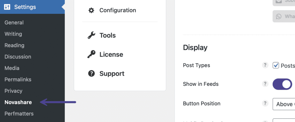
Click into the Novashare plugin settings.
Step 2
You can set a mobile breakpoint separately on both Inline Content share buttons and Floating Bar share buttons. Click on the submenu where you want to enable it. In the example below, we are setting a mobile breakpoint on “Inline Content.”

Step 3
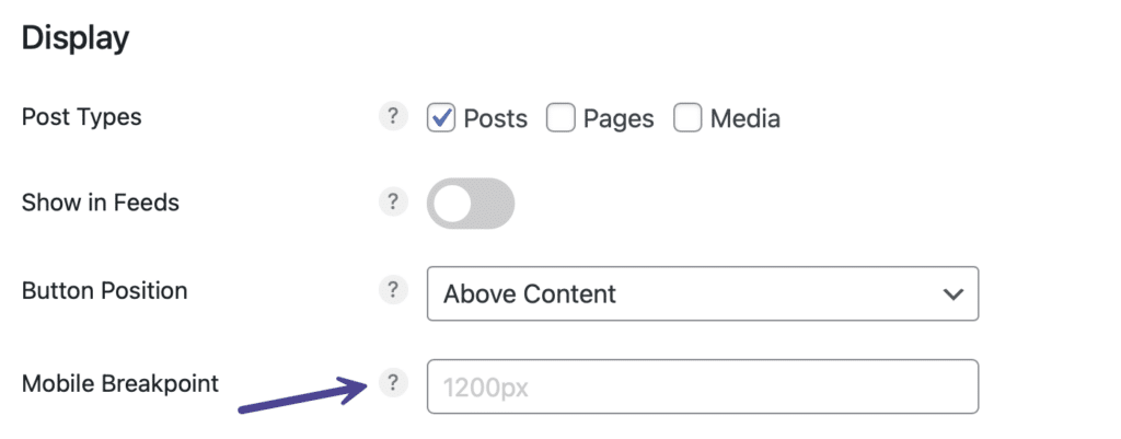
Scroll down to the “Display” section. Under “Mobile Breakpoint” set the width in pixels (px) where you want the inline mobile breakpoint to occur. Note: The default is 1200px.
Step 4
Scroll down and click “Save Changes.”
Step 5
You will then want to choose what you want to happen at the breakpoint. You can set it to hide above the breakpoint, hide below the breakpoint, or both.
Hide above breakpoint
To hide above the breakpoint, follow the steps below.
Step 1
Click into the Novashare plugin settings.

Step 2
You can hide above the breakpoint separately on both Inline Content share buttons and Floating Bar share buttons. Click on the submenu where you want to enable it. In the example below, we are hiding above the breakpoint on “Inline Content.”

Step 3
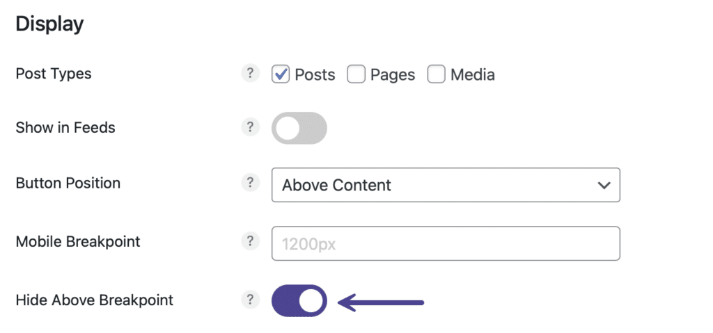
Scroll down to the “Display” section. Toggle on the “Hide Above Breakpoint” option. Note: This is disabled by default.
Step 4
Scroll down and click “Save Changes.”
Hide below breakpoint
To hide below the breakpoint, follow the steps below.
Step 1
Click into the Novashare plugin settings.

Step 2
You can hide below the breakpoint separately on both Inline Content share buttons and Floating Bar share buttons. Click on the submenu where you want to enable it. In the example below, we are hiding below the breakpoint on “Inline Content.”

Step 3
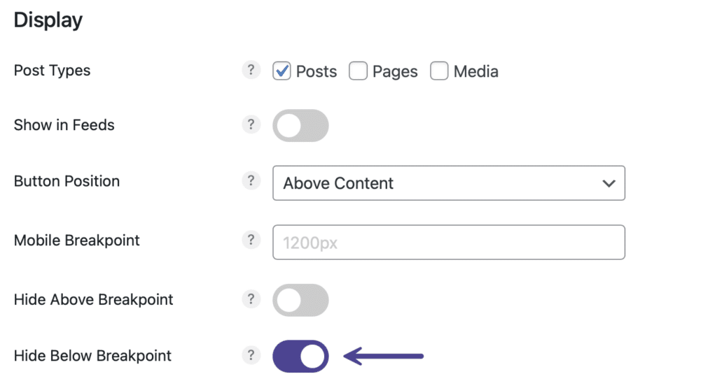
Scroll down and toggle on the “Hide Below Breakpoint” option. Note: This is disabled by default.
Step 4
Scroll down and click “Save Changes.”
Mobile max width
You can set the max width in pixels (px) up to where the Floating Bar share buttons should display on mobile.
Step 1
Click into the Novashare plugin settings.

Step 2
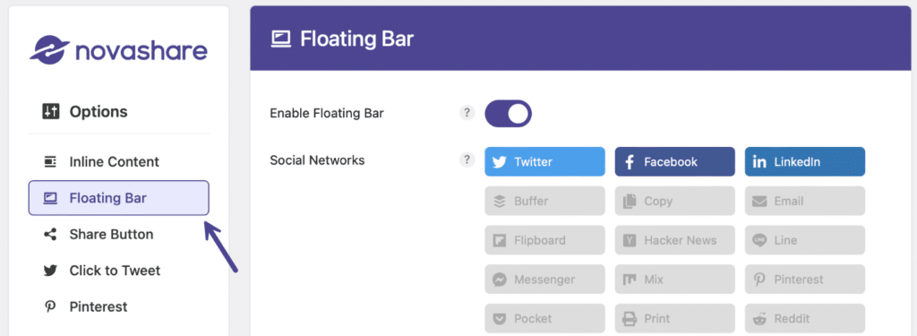
Click on the “Floating Bar” submenu.
Step 3
Scroll down and under “Mobile Max Width” set the width in pixels (px) up to where the Floating Bar share buttons should display on mobile. Note: The default is 800px.

Step 4
Scroll down and click “Save Changes.”